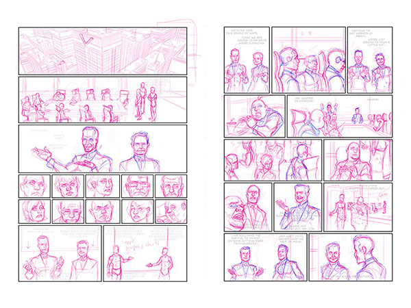
One of the things I’m really enjoying with this issue is Jamison’s use of more than the average number of panels in several sequences of the book. I’ve always liked adding more panels rather than less and showing more angles and shots to advance the storytelling. On the left page here, for example, the 4th tier of panels was originally a POV shot. With the number of people at the table, though, I wasn’t able to get the clear view of what everyone seated around it was thinking so I broke it up into a bunch of smaller reactions shots.

It’s a bit light here, but you can just make out the rough lettering blocked in. I like to do a rough pass at the lettering before doing the artwork layouts so that I can best make use of the space, and to make sure nothing critical is going to get covered up. With the extra panels this is very useful in making sure I can keep the visuals clear.
-Ryan